UX/UI DESIGNER
• User Research • User Flows • Task Analyses • Wireframing • Prototyping
• Usability Testing • Information architecture • User Interface Design
Wayfinder
PC | PS4 & PS5
Company: Airship Syndicate
What is Wayfinder
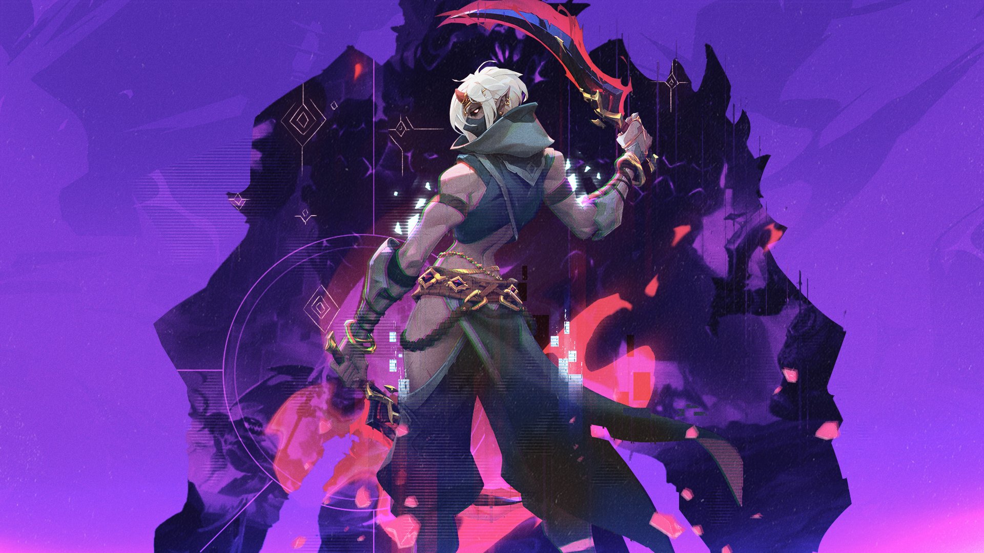
Become a Wayfinder, and unlock their powers as you choose your path and playstyle while pushing back a hostile force that has overtaken your world. Control the Chaos as you directly shape and customize the endless adventures you go on with friends because Wayfinders are stronger together.
My Role(s)
User Research, User Flows, Task Analyses, Wireframing, Prototyping, Usability Testing, Information Architecture and User Interface Design

Projects
Abilities Menu
Abilities Menu (Live)
Abilities are a big part of Wayfinder and are a core system early on for the player to explore playstyles. The menu identifies the various active and passive abilities the player has available on the active character.
Style Menu
Style Menu (Live)
The style menu allows the player to switch customization features on the player’s character. Allowing the player to customize the way their character looked, and the different emotes and mounts the player can have
Ability Menu
Abilities are a big part of Wayfinder and are a core system early on for the player to explore playstyles. The menu identifies the various active and passive abilities the player has available on the active character.
Goals & Motives
Make the system easy to use on one page that can illustrate all the information without having to dive into another menu state.
Have the screen feel impactful when you are unlocking new abilities like you are making a big choice.
Easy to quickly see your ability level and upgrade the abilities easily
Information should be easy to understand and find on the individual abilities. Showcasing core abilities, weapon ability, and the passives.
Wireframes
One of the big things we wanted to drive for the player was a quick glimpse of what they can unlock and what abilities can do for the player’s character and ways they can think about how that helps their team.
We explored the idea of keeping everything linear and easy to follow here to keep it inline with a sense of progression.
However this was something that our internal testing felt that took away the feeling of choice with keeping it this way.
We were thinking here we would give the character a bit more center focus and keep the connection between the character and abilities centered focus
We realized there was a bit of information that was kind of pushed out of the way and at the same time too much information.
Giving the abilities a little bit more of a stagger was a direction that our tests came back positive but here in this example it felt like way too much information. So we needed to find a way that would capture this feeling without the heaviness of the screen
The Solution
We kept with more of the stager and played a lot into the shape language. Something that was easy to navigate and gave a identifiable hierarchy of things on the page. Making sure that there was a direction of importance but also give the player choice and proper focus on these big abilities that have weight to them.
Final Product
The final shipped version of the Abilities menu.
Style Menu
The style menu allows the player to switch customization features on the player’s character. Allowing the player to customize the way their character looked, and the different emotes and mounts the player can have
Goals & Motives
Create a layout that is quick for the user to go in and out of to change the cosmetics of their character.
Make simple layouts that allow the player to easily see what customization options have already been equipped.
Make something familiar to the player that felt easy to grasp and navigate.
Wireframes
When building out the system we did a lot of research on inventory management and the way cosmetics were organized and displayed in a lot of different games that focus so much on the customization of characters. We want to make sure the identity of the player can be represented by the choices they made with the character.
We centered the wireframe around a title-type menu where players would have an easier time navigating. This is a common thread we are seeing with games, and players seem to find it intuitive.
This would allow us to also categories the items and inventory in a way that would be more manageable on the back-end and create a space where it would make adding things for the player more streamlined.
One of the biggest problems we were trying to solve was the color pallets and how they would be displayed to the player. Was this a separate screen altogether, or did it live in styles? How big is the scope for these colors/gradient “dyes”.
We originally were creating a spec that would capture these dyes in categories that the player would later unlock either by progression or by MTX/Store. When going back we realized for the first few seasons this scope was way smaller.
So consolidation within the style screen was an approach that we agreed on and moved forward with after various conversations with our internal testing group.
Final Product
The final product was to focus on the consolidation of assets and make it easier to navigate in & out of the styles to quickly express themselves through the character they have chosen. Making sure at a glace the player can decide what they want to prioritize in their customization.
The final shipped version of the Style menu.


